North, South, East, West: How Light Changes Paint Color
Natural light can completely change how a paint color looks. This post explains how room direction affects color and how to choose shades that actually work in your space.
How the Direction of Your Room Changes the Way Paint Color Looks
Natural light changes throughout the day, but it also changes depending on which direction it comes from. That light affects how warm, cool, bright, or dull a paint color appears once it’s on your walls. Understanding this can save you a lot of frustration and help you choose colors that actually look good in your space, not just on a sample card.
Let’s break it down in a simple, practical way.
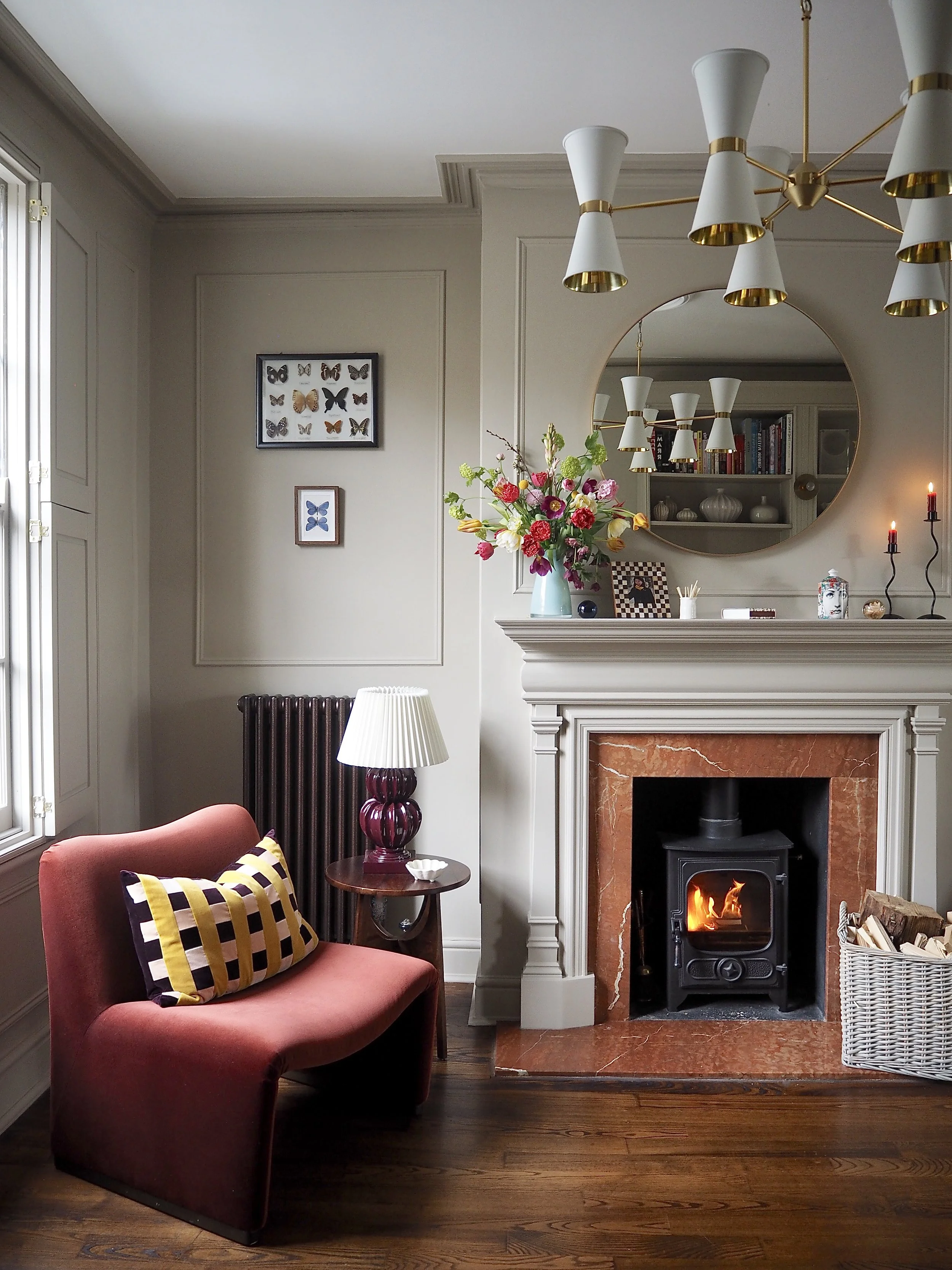
North-Facing Rooms: Cooler, Softer Light
North-facing rooms get indirect sunlight most of the day. The light tends to be cooler, grayer, and more consistent, without strong warmth or brightness. Because of this, colors in north-facing rooms often look a bit darker and flatter than expected.
Cool colors like blues, grays, and greens can feel especially chilly or dull here. A soft gray might suddenly look steely, or a pale blue can turn almost gloomy. That doesn’t mean you can’t use these colors — it just means you need to be more intentional.
In north-facing rooms, paint colors with warm undertones usually work better. For neutral color schemes, creamy whites, warm beiges, soft taupes, and muted warm greens can help balance the cool light. For example, Revere Pewter from Benajmin Moore is an iconic neutral with warm undertones. Noodle from C2 Paints is another great option, a creamy-white color made with natural pigments.

If you love color, then dusty pinks, warm terracottas or soft ochres can add warmth without overwhelming the room. Teracotta from Claybrook is another paint made with natural ingredients that is very warm and deep but still reflects a lot of light so won't darken or "shrink" a room.

South-Facing Rooms: Bright, Warm, and Flattering
South-facing rooms are the easiest to work with. They get strong, warm light for most of the day, which makes colors look brighter and richer. This light brings out warmth and depth, and it’s very forgiving.
Because the light is so warm, cool colors actually shine here. Blues feel crisp instead of cold, greens look fresh, and grays stay balanced rather than dull. Even darker colors tend to look vibrant instead of heavy.
Warm colors still work in south-facing rooms, but they can sometimes feel too warm. A beige might turn yellow, or a cream can look almost golden. If you’re using warm tones, it helps to choose ones that are slightly muted or balanced with a neutral base.
East-Facing Rooms: Warm Mornings, Cool Afternoons
East-facing rooms get bright, warm light in the morning and cooler, softer light later in the day. This means the room can feel very different depending on the time.
In the morning, warm light enhances cozy colors — soft yellows, warm whites, and gentle peach tones can look beautiful. But as the day goes on, those same colors may lose some of their glow and feel more neutral or subdued.
Balanced colors tend to work best here. Think soft neutrals, light greiges, gentle greens, or blues that aren’t too icy. Extreme warm or cool tones can feel inconsistent as the light changes, while mid-tone, flexible colors adapt more easily throughout the day.
West-Facing Rooms: Cooler Mornings, Dramatic Evenings
West-facing rooms are the opposite of east-facing ones. They feel cooler and dimmer in the morning, then fill with warm, golden light in the afternoon and evening.
This strong evening light can intensify colors a lot. Warm tones may look extra rich — sometimes almost too intense — while bold colors can suddenly feel overpowering.
To keep things balanced, softer or cooler colors often work well in west-facing rooms. Muted blues, gentle grays, and soft greens stay calm even when the light warms up. If you love warm colors, choosing slightly toned-down versions can prevent the room from feeling too heavy later in the day.
Why This Matters More Than You Think
Paint doesn’t exist in isolation. The same color can look completely different from one room to another, simply because the light hitting it is different. That’s why choosing paint based only on a swatch or someone else’s recommendation often leads to disappointment.
When you match your paint color to your room’s natural light, the color works with the space instead of fighting it. The room feels more comfortable, more intentional, and more like the version of the color you imagined in the first place.
If there’s one takeaway, it’s this: before picking a paint color, pay attention to which direction your room faces. That one detail can make the difference between a color you tolerate and one you genuinely love living with.
Advertisement
